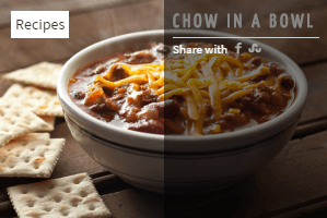
An instance with significant CSS additions to make its output more unique.
Step 1
Selecting the items
There is no specific recommendation for this particular example.
Step 2
Setting the configuration/layout
The module instance is shown in a position of the template that is a column, therefore the best suitable configuration/layout is vertical (in older versions) or column in the layout tab.
Step 3
Preparing individual elements
To show an image with text overlay, the best starting layout style is overlap
.
Each element has a width of 100% in order to take the full space allowed by the column template position.
| Item width | 100 |
| Item width unit | % |
| Style | overlap [images only] |
The head
of each item is an image, which is fetched from the image intro
parameter of each article.
The width is set to 300px, which is considered the maximum width the image will take, even when the column gets larger.
| Head type | image intro |
| Head width | 300 |
| Head height | 200 |
Step 4
Linking items
There is no linking it this particular example.
Step 5
Setting the categories
Categories are visible over the image, with the default styling. Labels are not set, therefore the label will be the category title. Nothing else is set, since only one item is shown here.
| Position | over picture |
| Style | default |
Step 6
Setting the title
The title HTML header (h3) is used, which adds an underline (it is dictated by the template).
Step 7
Setting the detailed information
Showing the social media icons is as simple as selecting the type share icons
from the body
tab.
| Show icon | no |
| Prepend text | Share with |
| Type | share icons |
Step 8
Styling the share icons
Go to the Information
tab and the Share icons
section.
Set the color to Background, the Radius to 10 and select the social services you want to show. Here, we selected Facebook, then Stumbleupon.
Step 9
Improving the output visually
A few improvements are necessary to make this instance 'shine':
- change the title color,
- make the category label 'see-through' and add a colored border (great when showing different categories, it makes categories easy to differentiate),
- change the see-through color of the body,
- position detailed information at the bottom.

/* color the title */
#lnee_165 .head_left .newstitle {
	color: white;
}

/* make the category 'see-through' and add a border */
#lnee_165 .newshead .picture .catlink {
	opacity: .7;
	border-top: 4px solid red;
	text-transform: uppercase;
}

/* change the see-through color of the body */
#lnee_165 .newsinfo {
	background-color: rgb(128, 0, 0);
	background-color: rgba(128, 0, 0, 0.5);
}

/* position the detailed info at the bottom */
#lnee_165 .newsextra {
	position: absolute;
	bottom: 10px;
	right: 10px;
}
Note 165 in #lnee_165 needs to be replaced with your module id.
